
ST. PAUL, Minn. – A lot of Minnesotans wanted the state bird – the loon – in a new state seal. And they got it. The State Emblems Redesign Commission has unveiled its recommendation. Now the Legislature will decide whether to accept it. The recommendation of the 13-member commission was unanimous, although Secretary of State Scott Simon, a commission member, noted that fine-tuning may still occur — like removing the 1858 year of statehood and the state motto “LeToile du Nord.” Nobody much in Minnesota has spoken French since the fur trappers back before even territorial times. Also: Should the loon’s right eye be their unusual bright red, which some people , even loon lovers, admit is unsettling. Like pink eye, anyono\e? Blood-shot?
Public input
The commission considered comments on submissions for a state seal submitted online by 6,000 Minnesotans. Still before the commision is recomending a new state flag. The commission received 15,000 comments on a redesign of the flag.
Verbatim
Simon: “We have two more scheduled meetings. That’s it. And although they’re long meetings, and in person, I favor doing as much reasonable winnowing as we can. Because if we go into the next meeting, doing deep dives on 11 things — six flags and five seals — I really fear we’re going to run out of time.”
Walz likes loon
Governor TimWalz sidestepped divisive artistic and cuitural issues about the prooosed state seal. He said he was a fan if the loon. Period.

Fine-tuning ahead. Colors or plain? How many doodads? Any at all? What shape the waves? How many?
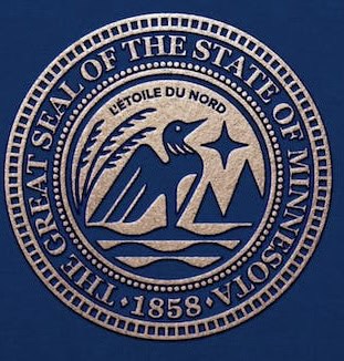
Love it? Hate it? Now is the time to weigh in with your state legislators.
What’s in beholder’s eye?
Although a loon is present, the redesign is not without critics:
Pros
> Much proved over cluttery former seal.
> Gone is imagery that exalts white Minnesotans and slights native Americans.
> Gone too is the current seal’s sin ofomission. Among all its mixed messages, somebody forget even a nod to acknowledge that women live here. Have they not ever done anything worth noting? While saying too much, the old seal says too little.
Cons
> The state motto, in French, is obscure and cluttery.
> The year of statehood, 1858, is one element too many for good design.
> So too the outer ring of whatever they’re supposed to represent. And also the inner ring of stars.
> Too many elements: A chaff of grain, the North Star, a line of trees (or are they moutainns? Hills? Bluffs?), and what’s that at the bottom? Oh, water, you say. Looks